Week 2: SketchUp Model 2
I had my 2nd attempt at creating a piece of architecture with SketchUp. This time, I definitely had better control and in my opinion, this model was a better model than last time.
At the moment, I feel like the underground part of the structure is its strongest aspect.
Section I referred to:
Words -
CJ Hendry - Rubble
Gucci - Nightmare
Pictures of the new model:
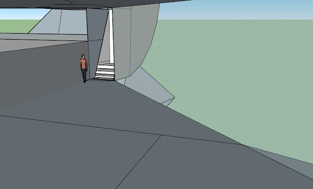
This is the scale of the model in comparison to people:
Material Selection:
For the top part of the architecture, I had to portray the idea of rubble in my design. Therefore, I used stone for the building's surface. The rough texture will exhibit the rough, course characteristics or rubble and dissembled pieces.
The ground is covered in gravel.
Ground floor in this model is made of glass. Since this is the place where both the designers will exhibit their work, I thought that it was very important that sufficient sunlight would enter the building to highlight the natural beauty of both designers' work. Also glass allows people outside to see what is going on - this will essentially them to come in the building to view CJ Hendry and Gucci's work in more detail.
The bottom section of the architecture is made of rough metal. I associate nightmare with a very uncomfortable, cold, dark experience or memory. I think that metal will make people feel enclosed and trapped. Metal seems very hard and sharp, connotating to the frightening experiences of nightmares. Furthermore, its texture is often of discomfort to others.
Difficulties:
I encountered multiple problems when creating the stairs inside the building. I spent a lot of time trying to make sure everything was right (from the size of steps to the path people would take to walk down the stairs). At the end, I decided to create the stairs separately and then add them into the architecture later. This is what the stairs look like in the building at the moment.
At the moment, I feel like the underground part of the structure is its strongest aspect.
Section I referred to:
Words -
CJ Hendry - Rubble
Gucci - Nightmare
Pictures of the new model:
This is the scale of the model in comparison to people:
(Entry to ground level)
Material Selection:
For the top part of the architecture, I had to portray the idea of rubble in my design. Therefore, I used stone for the building's surface. The rough texture will exhibit the rough, course characteristics or rubble and dissembled pieces.
The ground is covered in gravel.
Ground floor in this model is made of glass. Since this is the place where both the designers will exhibit their work, I thought that it was very important that sufficient sunlight would enter the building to highlight the natural beauty of both designers' work. Also glass allows people outside to see what is going on - this will essentially them to come in the building to view CJ Hendry and Gucci's work in more detail.
The bottom section of the architecture is made of rough metal. I associate nightmare with a very uncomfortable, cold, dark experience or memory. I think that metal will make people feel enclosed and trapped. Metal seems very hard and sharp, connotating to the frightening experiences of nightmares. Furthermore, its texture is often of discomfort to others.
Difficulties:
I encountered multiple problems when creating the stairs inside the building. I spent a lot of time trying to make sure everything was right (from the size of steps to the path people would take to walk down the stairs). At the end, I decided to create the stairs separately and then add them into the architecture later. This is what the stairs look like in the building at the moment.


Comments
Post a Comment